

synopsis
One of the greatest science fiction/fantasy novels ever published, The Anubis Gates takes literary history, lycanthropy, the Knights Templar, and a bizarre cast of characters into one of the most original and memorable time travel stories ever published. It won the 1983 Philip K. Dick Award for best original science fiction paperback.
Tim Powers is also one of the most collectible of all genre authors. Many consider this novel to be his masterpiece. But it has never been published in a deluxe state; not like this. Get ready. With a publication date of October 2013, it’s just down the road. You won’t believe your eyes.
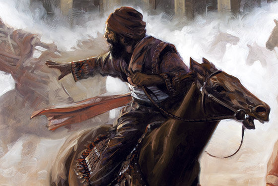
This new edition features 10 full page, full color illustrations by David Palumbo. These are exceptional paintings and perfectly compliment the text. Palumbo wrote: I was new to Powers’ work when approached about this edition, but became instantly hooked. There was so much rich visual material to choose from it was actually difficult to narrow down the scenes that I wanted to paint. I think I easily had ideas for twice as many as I could use. In the end, many choices were made based on the narrative flow and overall story which the images would make as a whole. The chosen scenes tended to be mostly night or otherwise dark, often torchlit, which seemed to be the setting for most of the key moments and I love the mood which it communicates. Doyle’s adventure is full of mystery and shadows and there’s certainly never a dull moment.
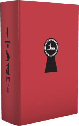
The book is designed by Jacob McMurray, and he also created a fold-out map of London and an infographic regarding the exploits of Dog-Faced Joe. These inserts are simply astonishing and will complement the text and book design in Each copy is signed by Powers, Palumbo, and McMurray in a handsome four-page signature insert. The book is bound in imported cloth and housed in a slipcase that can only be called unique. Indeed, we hope that the standard signed The Anubis Gates will be so amazing that you will swear you have your hands on the deluxe.
The book is typeset in Monotype Bulmer, designed in London by William Martin in the early 1790s. It is a period typeface that perfectly captures the time and setting of the novel. It is printed in two colors throughout. The book is bound in Suedeluxe with a lenticular image on the front board. Other extras include a top-edge stain, printed endpapers, ribbon markers, reinforced binding, and a gorgeous, heavy paper. The slipcase is unlike anything you have ever seen.
edition information
pricing
SOLD OUT